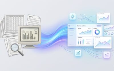
Most media monitoring reports look convincing at first glance.
There’s a sense of structure to them. Charts move, sentiment shifts, spikes appear at the right moments. It feels like something is being captured, something is being understood. And for a while, that’s usually enough to create confidence that the system is working.
But when you sit inside the actual decision-making conversations, a different pattern starts to show up.
Teams go through the report, acknowledge what’s in it, and then… continue operating the same way. Product decisions don’t change. Marketing direction stays largely intact. Leadership still asks what any of this actually means for growth, for demand, for the next move.
That’s usually the signal worth paying attention to.
Because it suggests that the issue isn’t a lack of data. It’s that the data isn’t being translated into something usable at the moment decisions need to be made.
TL;DR
Most media monitoring reports show what happened, but stop short of helping teams act on it.
The shift is from tracking mentions to understanding narratives, and from reporting activity to enabling decisions.
If your report doesn’t clearly answer “what do we do next?”, it’s not doing its job.
Table of contents
-
- Why your media monitoring report isn’t working
- What a decision-ready media monitoring report looks like
- Best media monitoring tools (and what they actually do)
- Why behavioral data changes the equation
- FAQ
Why your media monitoring report isn’t working

Most teams don’t set out to build ineffective reports. The intent is usually right. But over time, the structure of these reports drifts toward visibility instead of clarity.
And that’s where things begin to break.
1. You’re measuring mentions, not what they mean
It’s easy to focus on volume because it’s visible. A spike in mentions feels like something worth paying attention to, and often it is. But on its own, it doesn’t tell you much about what’s actually changing.
You’ve probably seen this play out. A campaign goes live, mentions increase, sentiment looks mostly positive, and yet when you look at downstream impact, there’s no real shift in demand or behavior.
That’s because mentions flatten everything into a single layer. They don’t tell you who is driving the conversation, what context it’s happening in, or whether it reflects curiosity, concern, or comparison.
Without that layer of interpretation, the report stays descriptive. It tells you something happened, but not whether it matters.
2. You’re seeing the market slightly too late
A lot of tools today position themselves as “real-time,” which sounds like a meaningful upgrade from older reporting cycles.
But in practice, what most teams experience is faster visibility into events that have already started unfolding. By the time something shows up clearly in your dashboard, it has usually been building for a while.
The narrative has already begun to take shape. Customers have already started reacting to it. Competitors may already be leaning into it.
So while the data is technically current, the insight is still slightly delayed.
And that small delay is often enough to shift you from acting early to reacting late.
3. You’re relying too much on what people say
Surveys and structured feedback are still widely used because they feel reliable. They’re clean, they’re organized, and they give you direct answers.
But they operate in a very specific environment. They capture what people say when asked, not what they do when making decisions in real contexts.
This is where things get subtle.
You might see stable satisfaction scores, consistent feedback, and no obvious warning signs. At the same time, conversion rates start to soften, competitor mentions increase, or search behavior begins to shift.
Nothing in the report looks broken. But something is changing underneath.
And because that change isn’t being captured early, it only becomes visible once it’s already affecting outcomes.
4. Your dashboard is trying to do too much
Over time, most teams add more layers to their monitoring setup. More filters, more views, more ways to segment the data.
Individually, each addition makes sense. But collectively, it often creates a system that is harder to interpret.
You end up with a lot of information, but no clear direction.
Teams spend time navigating dashboards, pulling views, comparing charts. But when it comes to making a decision, there’s still a gap between what the data shows and what needs to be done.
That’s where fatigue starts to set in. Not because there’s too little data, but because there’s too much of the wrong kind.
What a decision-ready media monitoring report looks like

When a report starts working properly, you can feel the difference almost immediately.
Conversations become more focused. Decisions get made faster. There’s less back-and-forth around interpretation.
That usually comes down to a few shifts.
1. From counting mentions to understanding narratives
Instead of reporting how much conversation is happening, the focus shifts to what that conversation is actually about.
For example, rather than saying “mentions increased this week,” a more useful insight would be:
-
- Pricing concerns are showing up more frequently in reviews
- Competitor comparisons are becoming more direct
- Certain product features are being questioned more often
This kind of framing gives teams something to work with. It connects activity to meaning, and meaning to potential action.
2. Bringing behavior into the picture
Conversations are useful, but they are only one layer of what’s happening.
When you bring in behavioral signals like search patterns, review depth, and product interactions, the picture becomes more grounded.
You start to see not just what people are saying, but what they are actively exploring, comparing, and choosing.
This is where a lot of early signals tend to show up.
For example, a gradual increase in searches for alternatives often appears before any major shift in sentiment. It’s quieter, but it’s often more telling.
3. Looking at demand, not just visibility
Metrics like Share of Voice can be useful, but they often reflect how much noise a brand is generating rather than how much demand it is capturing.
Share of Search, on the other hand, tends to reflect something closer to intent.
When more people actively look for a brand, it usually signals a deeper level of interest. Over time, this tends to correlate more closely with actual market movement.
This doesn’t mean one replaces the other entirely. But it does change which signal you prioritise when trying to understand growth.
4. Identifying what’s starting to form
One of the most valuable shifts is moving from reporting trends to identifying patterns before they fully emerge.
This might look like:
-
- A narrative that appears in small pockets across different channels
- A competitor gaining traction in specific contexts
- A recurring concern that hasn’t yet become widespread
These are the moments where decisions can still influence outcomes.
Once something becomes obvious, it’s usually already late in the cycle.
5. Making insights easier to act on
Ultimately, the usefulness of a report comes down to whether it reduces friction in decision-making.
A strong report doesn’t require multiple follow-up discussions to interpret. It doesn’t need to be translated into action.
It already contains that layer.
It helps answer:
-
- What needs attention right now
- Where the opportunity or risk is
- What should change as a result
This is where platforms like i-Genie.ai start to feel different in practice. The focus shifts from presenting data to connecting signals in a way that naturally leads into decisions.
Best media monitoring tools (and what they actually do)

If you look across the landscape, most tools fall into a few broad categories. Understanding these categories helps clarify what each tool is really designed to do.
| Category | Focus | Strength | Limitation |
| Tracking tools | Mentions & sentiment | Visibility | Limited context |
| Management platforms | Execution workflows | Scale | Reactive |
| Intelligence systems | Behavior + narratives | Decision-making | Requires shift in approach |
The difference between them isn’t just features. It’s how close they get to actual decision-making.
Some tools help you observe. Others help you act.
Why behavioral data changes the equation

One of the more interesting shifts happening right now is how teams are starting to value behavioral data.
Not because it’s new, but because it fills a gap that has always existed.
Example 1: The quiet shift
A SaaS company sees stable survey scores across two quarters. Nothing suggests a major issue.
At the same time:
-
- Searches for competitors start increasing
- Review sentiment becomes slightly more critical
- Comparison content begins to trend
Individually, none of these signals look dramatic. But together, they point to something forming.
By the time it shows up clearly in traditional reports, the shift is already underway.
Example 2: Attention without demand
A campaign generates strong engagement on social channels. Mentions are high, sentiment looks positive, and reach is significant.
But when you look at search behavior, nothing really changes.
People are noticing the campaign, but they’re not taking the next step.
This is where the difference between attention and intent becomes visible.
Behavioral data doesn’t replace other signals entirely. But it adds a layer that is much closer to actual decisions being made.
And that tends to make it more useful when timing matters.
Most teams don’t struggle because they lack information
They struggle because the information they rely on arrives just a little too late to influence what happens next.
The shift isn’t about having more data.
It’s about working with signals that stay close enough to real-world behavior that you can still do something with them.


")